Uncertainty visualization
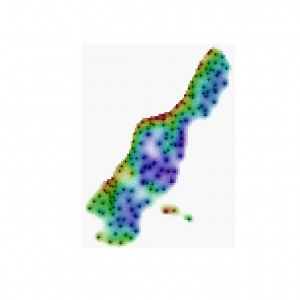
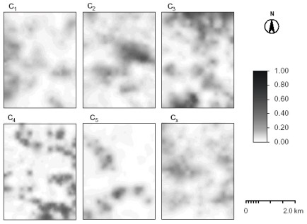
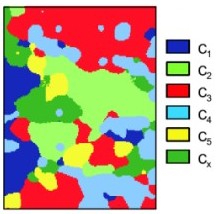
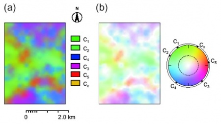
his article demonstrates two GIS methods for visualization of uncertainty associated with spatial prediction of continuous and categorical variables. In the case of continuous variables, the key issue is to visualize both predictions and the prediction error at the same time, while in the case of categorical data, the key issue is to visualize multiple memberships and confusion in-between them. Both methods are based on the Hue-Saturation-Intensity (HSI) color model and calculations with colors using the color mixture (CM) concept. Whitening is an intuitive color model – Hue (type of color) is used to visualize values or taxonomic space and whiteness (paleness) is used to visualize the uncertainty. In the case of continuous variables, we use a two-dimensional legend – vertical axis (hues) is used to visualize the predicted values and horizontal axis (whiteness) is used to visualize the prediction error. In the case of categorical variables, a circular legend is used – perimeter (hues) defines the taxonomic space and radial distance represents the confusion. The methods are illustrated using two examples: (a) interpolation of soil thickness using regression-kriging and (b) fuzzy k-means classification of landforms classes. For more details, see some of the following references :
- Hengl T., Heuvelink G.M.B., Stein A. 2004. A generic framework for spatial prediction of soil variables based on regression-kriging. Geoderma 122(1-2): 75-93.
- Hengl T., Walvoort D.J.J., Brown A. 2004. A double continuous approach to visualisation and analysis of categorical maps. Int. Jou. of Geographical Information Science, 18(2): 183-202.
- Hengl T. 2003. Visualisation of uncertainty using the HSI colour model: computations with colours. 7th International Conference on GeoComputation (CD-ROM), pp. 8.
|
Instructions:
STEP 0: Download and install the most recent version of R/ILWIS and unzip the data to a working directory. ILWIS scripts you should download and unzip to "C:/Program files/ILWIS/Scripts/" folder. Detailed explanation of GIS operations and ILWIS commands can be found in the ILWIS help documentation or user's guides (both available via the 52north initiative). If you need more details on how to create and run a script, I advise you to read the ILWIS 3.0 Academic user's guide chapter 12. The ILWIS script consists of set of commands that can be used with up to nine script parameters. These can be either spatial objects, values or textual strings. A script, in principle, consists of two parts: definition of script parameters and list of commands. Sign "//" is used to exclude to insert comments and explanation of formulas.
Contents |
Visualization of prediction error
Visualization of uncertainty using whitening in ILWIS
here are two options to visualize uncertainty of predictions: by using colour mixing (VIS_error) or by using pixel mixing (VIS_sim). See also Hengl et al. (2002) for more details about the algorithms used. For pixel mixing, you will also need to derive simulated values (equiprobable realization) instead of using the predictions. Follow this guide to learn how to produce realizations using the same prediction model. The advantage of pixel mixing is that the final map will show both how significant is the short-range variation (nugget variation) and the areas where the model is less certain.
- STEP 1: Download the and unzip the ILWIS scripts for visualization of prediction error, best in in the default directory of scripts (e.g. "C:/Program files/ILWIS/Scripts/").
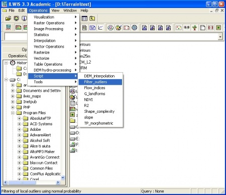
- STEP 2: Run a script from the to left menu (operations list) or from the main menu -> Operations -> Scripts. Use the help button to find more information about the algorithm. See example of how to enter parameters for the script.
- STEP 3: If you are using color mixing, you will need to use this legend (legend2D.tif) to create final maps.
TIPS: You can manually change the lower and upper values for both prediction and error maps. Stick to the 0.4 and 0.8 (max 1.0) as the default values for the normalized prediction error values. A satisfactory prediction is when the model explains more than 85% of the total variation (normalized error = 40%). Otherwise, if the values of the normalized error gets above 80%, the model accounted for less than 50% of variability at the validation points and the prediction is unsatisfactory. For more details, see the publications above.
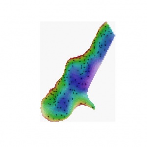
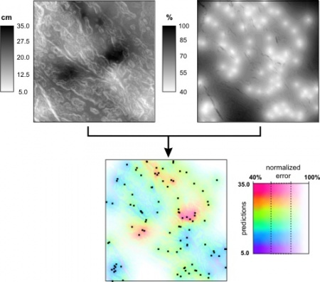 Figure: Visualisation of uncertainty for a quantitative variable (topsoil thickness in cm) interpolated using regression kriging: uncertainty included with whiteness and the accompanying two-dimensional legend. For more details about the case study, read this article. |
Purpose of the VIS_error script is to simultaneously visualize the predictions and the estimated prediction error. Input parameters are: %1 - prediction map (z), %2 - z1 lower value, %3 - z2 upper value, %4 - prediction variance map (e), %5 - e1 lower value (default=0.4), %6 - e2 upper value (default=0.8), %7 - original variance, %8 - name of the output file. By default use 40% and 80% for e1 and e2.
Purpose of the VIS_sim script is to simultaneously visualize one realization and the estimated prediction error. Input parameters: %1.mpr - simulated values, %2 - prediction error, %3 - original sampled variance. Note that the results of visualization can often be quite discouraging, depending on the amount of variation explained by the model. To improve the precision of predictions, use block-kriging or try to improve the prediction model.
Visualization of uncertainty using whitening in R
The same algorithm can be also implemented using R computing environment. To be able to run the whitening.R, you will need to first obtain packages rgdal, maptools and colorspace. Note that the results might slightly differ between ILWIS and R, which is mainly to somewhat different HSI-RGB conversion algorithms.
We start by loading the required packages:
UNIQ744c3fa3350dab6-geshi-00000000-QINU
For purpose of this exercise, we can use the Geul case study (gstat):
UNIQ744c3fa3350dab6-geshi-00000001-QINU
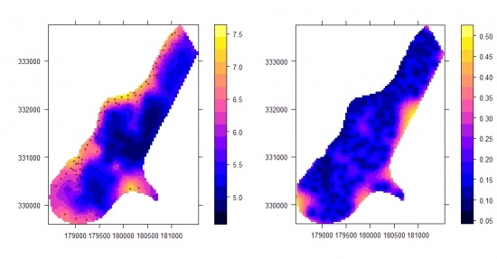
This is a standard way the predictions and the prediction error are visualized. Now, we can visualize both maps together using whitening. We start by setting up threshold levels (lower and upper limits), and stretching the values within that range:
UNIQ744c3fa3350dab6-geshi-00000002-QINU
We can generate the HSV bands using:
UNIQ744c3fa3350dab6-geshi-00000003-QINU
The HSV values can be converted to RGB bands using:
UNIQ744c3fa3350dab6-geshi-00000004-QINU
To display a true RGB image in R, use the SGDF2PCT method (note that SGDF2PCT method is limited to 256 colors only!):
UNIQ744c3fa3350dab6-geshi-00000005-QINU
In the last step (optional), we can set the right georeference and export the map to e.g. GeoTIFF format:
UNIQ744c3fa3350dab6-geshi-00000006-QINU
Visualization of multiple memberships
STEP 1: Download and unzip the ILWIS scripts and sample dataset for visualization of multiple memberships in some working directory (e.g. "d:/ILWIS_maps/"). This is the Wesepe dataset used in the paper of de Gruijter et al. (1997).
STEP 2: Select the representation colors and visualize the multiple memberships:
a) Select colours freely and visualize the memberships using the defuzzification (Simple_RGB).
// ILWIS script:
//Created by: T. Hengl (http://spatial-analyst.net)
//Input parameters: %1-%8 memberships, %9 - domain where the class names and colors are defined
//Purpose: Calculates the MB class having the highest MB value

maxMB_01=max(%1, %2, %3)
maxMB_02=max(%4, %5, %6)
maxMB_03=max(%7, %8)

//max1MB - maximum membership value per pixel

max1MB=max(maxMB_01,maxMB_02,maxMB_03)
calc max1MB.mpr

// Choose the representation color for that class

Simple_RGB{domain=%9}=iff(max1MB=%1, "c1", iff(max1MB=%2, "c2", iff(max1MB=%3, "c3", iff(max1MB=%4,
      "c4", iff(max1MB=%5, "c5", iff(max1MB=%6, "ext", ?))))) )
setdom Simple_RGB.mpr %9 [- force]
calc Simple_RGB.mpr -force

breakdep Simple_RGB -force
setdescr Simple_RGB.mpr Legend for the colour map as highest MB

del maxMB_0?.mpr -force
b) Select the colors freely and use the Pixel Mixture technique (PM_RGB). Note that you can also simulate values and produce an animation such as the one down-below.
// ILWIS script:
//Created by T. Hengl (http://spatial-analyst.net)
//Input parameters: %1-%6 membership maps, %7 - domain where the class names and colors are defined
//Purpose: script to calculate mixed pixels, six memberships: c1, c2, c3, c4 ,c5 cx;
//needs the georeference; domain set at {dom=value;vr=0.000:1.000:0.001}

c1_sim=rnd(sqrt(%1)*1000)/1000
c2_sim=rnd(sqrt(%2)*1000)/1000
c3_sim=rnd(sqrt(%3)*1000)/1000
c4_sim=rnd(sqrt(%4)*1000)/1000
c5_sim=rnd(sqrt(%5)*1000)/1000
cx_sim=rnd(sqrt(%6)*1000)/1000

maxMB_01=max(c1_sim, c2_sim, c3_sim)
maxMB_02=max(c4_sim, c5_sim, cx_sim)
max1MB=max(maxMB_01,maxMB_02)
calc max1MB.mpr

PM_sim{domain=%7}=iff(max1MB=c1_sim, "c1", iff(max1MB=c2_sim, "c2", iff(max1MB=c3_sim,
   "c3", iff(max1MB=c4_sim, "c4", iff(max1MB=c5_sim, "c5", iff(max1MB=cx_sim, "ext", ?))))) )
setdom  PM_sim.mpr %7 [- force]
calc PM_sim.mpr -force

breakdep PM_sim.mpr -force
setdescr PM_sim.mpr Single randomization of pixel mixture for Wesepe dataset

del maxMB_0?.mpr -force

//To run multiple simulations you can use this extra line:
//copy PM_sim.mpr PM_sim01.mpr -breakdep
b) Select the colour representations using some objective method - see Hengl et al. (2004). You can then also use the colour wheel that reflects geometrical position of class centres in the attribute space. In this case you first need to estimate the Hue values at the color wheel for each class (see table HSI_RGB) and then you can run the script (Cont_RGB).
// ILWIS script:
//Created by: T. Hengl (http://spatial-analyst.net), last update June 2004.
//Input parameters: %1-%6 - membership maps; representation values are in the table "HSI_RGB";
//Purpose: Calculation of the R G B bands based on the membership values and representation values;
//use zero map for missing maps: zero.mpr=iff(isundef(%1),?,0); no need to calculate the sumMB if it is = 1

sumR = %1*TBLVALUE(HSI_RGB, "R", 1)+%2*TBLVALUE(HSI_RGB, "R", 2)+%3*TBLVALUE(HSI_RGB, "R", 3)
    +%4*TBLVALUE(HSI_RGB, "R", 4)+%5*TBLVALUE(HSI_RGB, "R", 5)+%6*TBLVALUE(HSI_RGB, "R", 6)
sumG = %1*TBLVALUE(HSI_RGB, "G", 1)+%2*TBLVALUE(HSI_RGB, "G", 2)+%3*TBLVALUE(HSI_RGB, "G", 3)
    +%4*TBLVALUE(HSI_RGB, "G", 4)+%5*TBLVALUE(HSI_RGB, "G", 5)+%6*TBLVALUE(HSI_RGB, "G", 6)
sumB =  %1*TBLVALUE(HSI_RGB, "B", 1)+%2*TBLVALUE(HSI_RGB, "B", 2)+%3*TBLVALUE(HSI_RGB, "B", 3)
    +%4*TBLVALUE(HSI_RGB, "B", 4)+%5*TBLVALUE(HSI_RGB, "B", 5)+%6*TBLVALUE(HSI_RGB, "B", 6)
sumMB = %1+%2+%3+%4+%5+%6

// Calculate separate R G B band from as the average value from the representations

cont_R{domain=image}= sumR / sumMB
cont_G{domain=image}= sumG / sumMB
cont_B{domain=image}= sumB / sumMB

calc cont_?.*

// calculate final mixed colors map

cont_RGB=color(cont_R, cont_G, cont_B)
cont_RGB_H=clrhue(cont_RGB)
cont_RGB_S=clrsat(cont_RGB)
CI_S{dom=Value, vr=0.000:1.000:0.001}=1-cont_RGB_S/210
cont_map=colorhsi(cont_RGB_H, cont_RGB_S, (120+135*CI_S))

calc cont_RGB.mpr
breakdep cont_RGB.mpr -force
calc cont_RGB_?.mpr
calc CI_S.mpr

// add whiteness to visualise the uncertainty

cont_map=colorhsi(cont_RGB_H, cont_RGB_S, (120+135*CI_S))
calc cont_map.mpr

del sum?.mpr -force
del cont_?.mpr -force
del sumMB.mpr -force
<Rating> Rate this article: 1 Poor and in error 2 Far from ready 3 Needs improvements 4 Minor corrections 5 Very useful!! </Rating>
